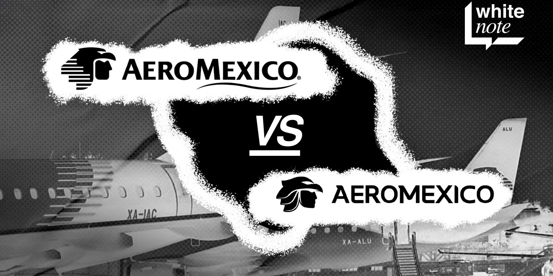

Hello everyone! Did you miss us? We’re back! Today, we’re diving into the new logo of Aeroméxico, one of Mexico’s most recognized airlines. You’ve probably seen it on social media or in the news, and as with any change, opinions are divided. Here, we’ll share an analysis of its strengths, some critiques, and how this visual update ties into the airline’s current situation.
 Cool Critique
The first thing that stands out is Aeroméxico’s choice of a modern, softened design. This is reflected in the curved, organic lines and a more refined typeface, elements that bring freshness and align the brand with contemporary graphic design trends.
One well-received element is the retention of the iconic “Cuauhtli,” the Aztec eagle, which has always been part of the airline’s visual identity. Though it has been stylized and simplified, it remains as a nod to the brand’s roots. This balance between renewal and tradition helps Aeroméxico project a modern image without losing its original essence, which is essential to remain recognizable and appreciated by its users.
 The new image is also seen as an attempt to position Aeroméxico as a more exclusive airline. This update feels sophisticated, aligning with other top-tier international airlines. This perception of enhanced quality is crucial in a sector where airlines strive to differentiate themselves and attract travelers who value both price and flight experience.
On a brand strategy level, this change reflects a global trend where many companies have opted to simplify and streamline their logos, adapting to the digital environment. Brands like Airbnb, Volkswagen, and Mastercard have followed a similar path, redesigning their logos to be more versatile on screens, social media, and mobile applications. In this sense, Aeroméxico seems to be moving in the right direction.
Not-So-Cool Critique
As with any redesign, not everyone is satisfied. Some feel that the new version has lost the robust, geometric character of the previous logo, which conveyed strength and power. For these critics, the change has resulted in a softer design, leading to the perception that Aeroméxico has set aside an essential part of its identity.
Another point of controversy is the level of respect given to Raúl Pérez Duarte, the designer of Aeroméxico’s original logo, who left an important legacy in the brand’s history. Pérez Duarte created a symbol that was not only visually strong and geometric but also represented the Eagle Knight, a symbol deeply connected to Mexican culture. His design captured national identity and managed to stand out in the competitive aviation sector, where differentiation is key. By not acknowledging Pérez Duarte’s legacy in the current redesign, many feel that his valuable contribution has been undervalued, which has been perceived as a lack of respect toward his work.
 Another highlighted aspect is legibility. Although the typography has an elegant style, some feel it looks generic and could easily be mistaken for that of other airlines. In a highly competitive industry like air travel, maintaining a distinctive visual identity is essential to capture consumers’ attention. The loss of that emblem might negatively impact the brand’s perception.
Finally, nostalgic fans have expressed discomfort with the change, as they had become accustomed to the previous design. This is a common phenomenon in brand redesigns, where nostalgia influences public opinion, making it harder to accept something new, even if the design is high-quality.
In Summary
Aeroméxico’s new visual identity has garnered both praise and criticism. The challenge will be ensuring that this new image continues to represent the values and essence of the brand. Time will tell if this redesign becomes the airline’s next visual icon.
This rebranding, however, does not occur in a vacuum. Aeroméxico is facing major challenges, such as a potential pilot strike, which could seriously impact its operations. This contrast between visual evolution and internal tensions raises a question: will this new identity be enough to maintain public trust in times of uncertainty?

The rebranding also opens an interesting conversation about the coherence between a company’s visual identity and its actions. While a new image can enhance a brand’s perception, if it’s not accompanied by improvements in customer experience or operational and financial stability, it may fall short. Like many brands, Aeroméxico seems to be betting that this visual change will mark the beginning of a new era, but the real challenge will be maintaining public trust as it navigates these turbulent times.

Ultimately, the success of this rebranding will depend not only on aesthetics but also on how the airline manages the challenges it faces. And what do you think of the new logo? Do you think it’s a good move, or will we miss the previous one? Leave us your comments!
At Whitenote, we’re always fascinated by analyzing how major brands handle their visual changes, and Aeroméxico’s case is a great example of how rebranding can influence a company’s narrative